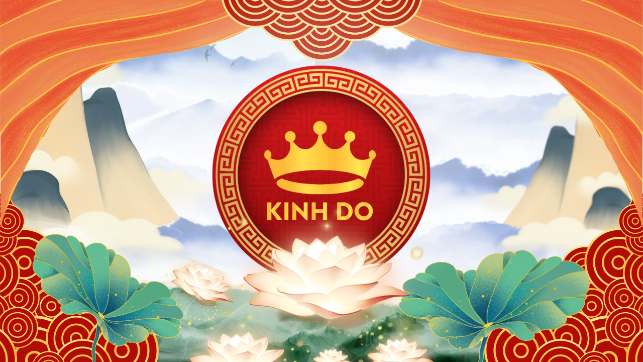
Lien Son Van Canh
Team : Như Ý
Member
Ms Nguyễn Ngọc Như Ý
Mrs Nguyễn Ngọc Như Ý
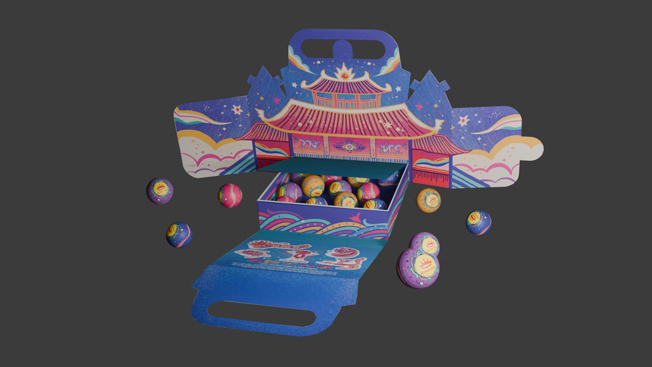
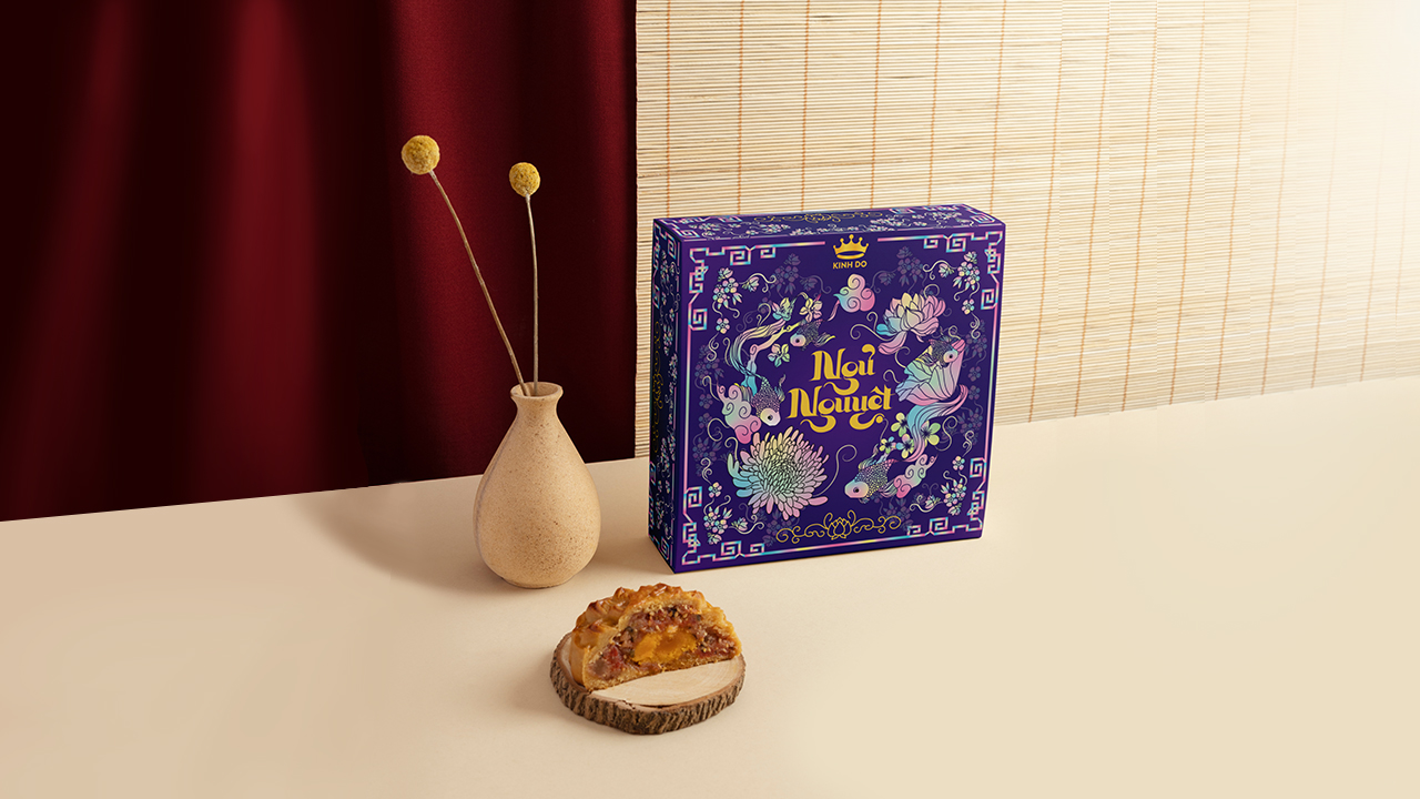
Upon contemplating Kinh Do mooncakes, I envision elegant lotus flowers, mountains shrouded in mist, and a blue sky adorned with soft clouds. These elements evoke a sense of peace, tranquility, and lightness, harmonizing to create a gentle yet emotionally resonant portrayal of nature.
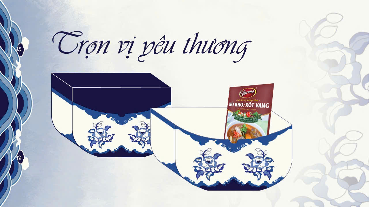
In this packaging design, I have selected the lotus flower as the central symbol, as it not only embodies purity but also reflects the flavor profile of Kinh Do's lotus seed mooncake, a favorite among many. The graceful white lotus blooms rising softly from the water, coupled with the mountains and clouds, create a vast, open space. This imagery also represents the diversity of mixed mooncakes—a delightful fusion of various fillings that culminates in a rich and unforgettable taste experience.
Furthermore, the white background of the design imparts elegance while also recalling the coconut milk mooncake, one of Kinh Do's most cherished offerings. The pure, bright white color, reminiscent of the soft cake crust, accentuates the details of the lotus flowers and surrounding mountains. This approach aims to pay tribute to the sophistication and richness of the flavors that Kinh Do presents at each Mid-Autumn Festival.
Classic and Tet-style motifs are similarly incorporated, from decorative borders to water wave patterns, evoking the warm and traditional ambiance of the full moon festival. My design is a harmonious amalgamation of natural elements, creatively communicating Kinh Do's unique flavor through visual imagery.
I have chosen to name my packaging design 'Lien Son Van Canh'. This title encapsulates the core idea I wish to convey: the fusion of pure lotus flowers, majestic mountains, and floating clouds within an expansive setting. Together, these elements create a serene natural tableau that evokes a sense of gentleness and depth, mirroring the richness and fullness present in each Kinh Do mooncake flavor.
- แชร์: