MLOX
Team : Chutirat
Member
Ms ชุติรัตน์ เลียงสุนทรสิทธิ์
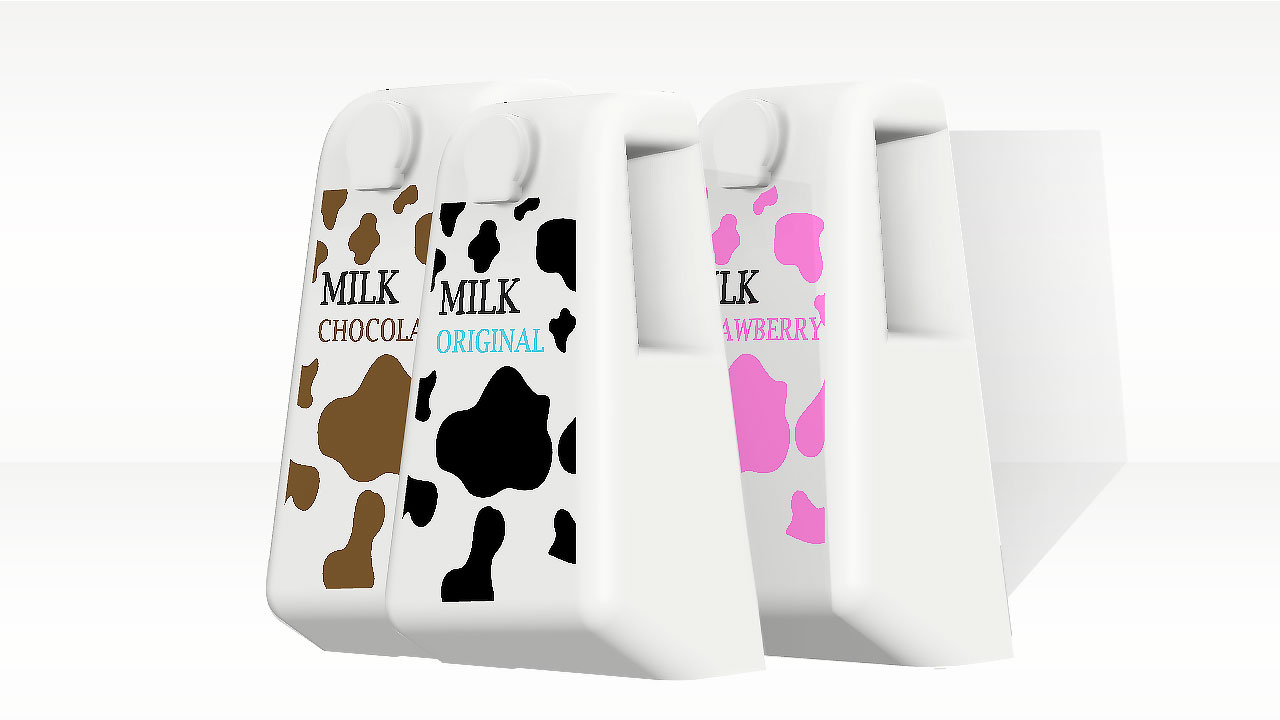
As we age, the first thing we notice is that our eyesight deteriorates. Most of the elderly tend to begin to lose sight if the text is too small. And many people like to ask for the expiration date on which part of the package. We therefore bring the expiration date to be the most prominent at the top of the box, which is the second point from the front of the box that our eyes will focus on. We made the text bigger to make it more visible and red. in the part of the box We want simplicity with just the taste of the milk. We use the cow pattern to indicate that the packaging is milk and change the color of the cow pattern to indicate the taste. By using colors that most people tend to understand easily. And on the back of the packaging we use visual communication for easy understanding.
which In terms of packaging design We have made an angle at the base of the box. We want to make this milk pouring more convenient for the elderly who are not as strong as before. can be poured without lifting from the table In addition, on both sides we have cutouts for easy grip. For the lid of the milk carton, we made a pull stopper instead because in the elderly, the lid is rarely worn out by itself and to reduce the force of opening. We use plastic material to make this packaging. Older people generally like to reuse their used bottles, so we designed this too. In addition, we designed it to be simple and to keep it minimal in the way that people tend to use it.
- แชร์: