Vietnamese Tea Brand - Ocha
Team : WE ARE DI
Member
Ms Di Tiet
Mr Duy Nguyen
- ABOUT THE Ocha BRAND:
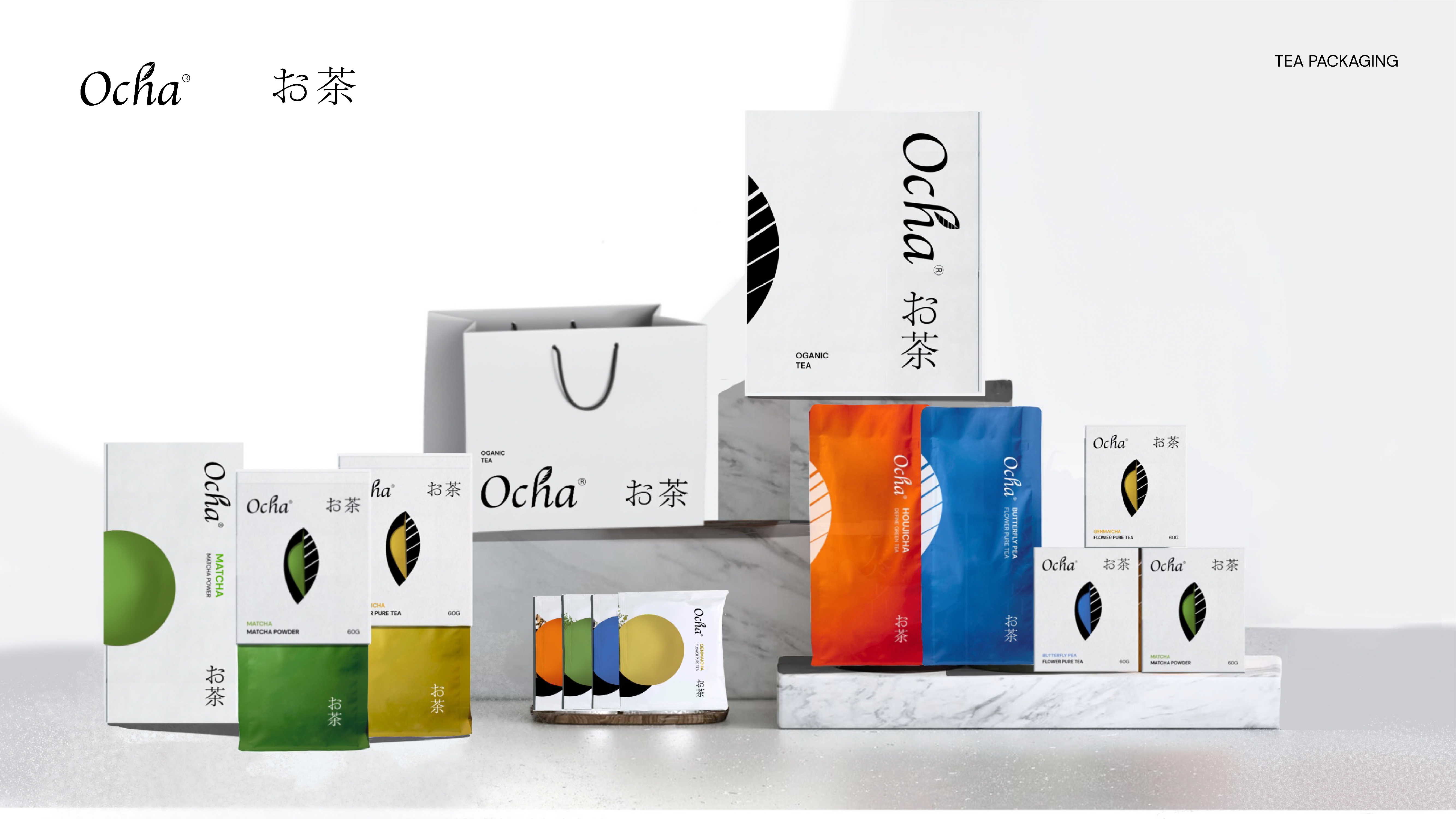
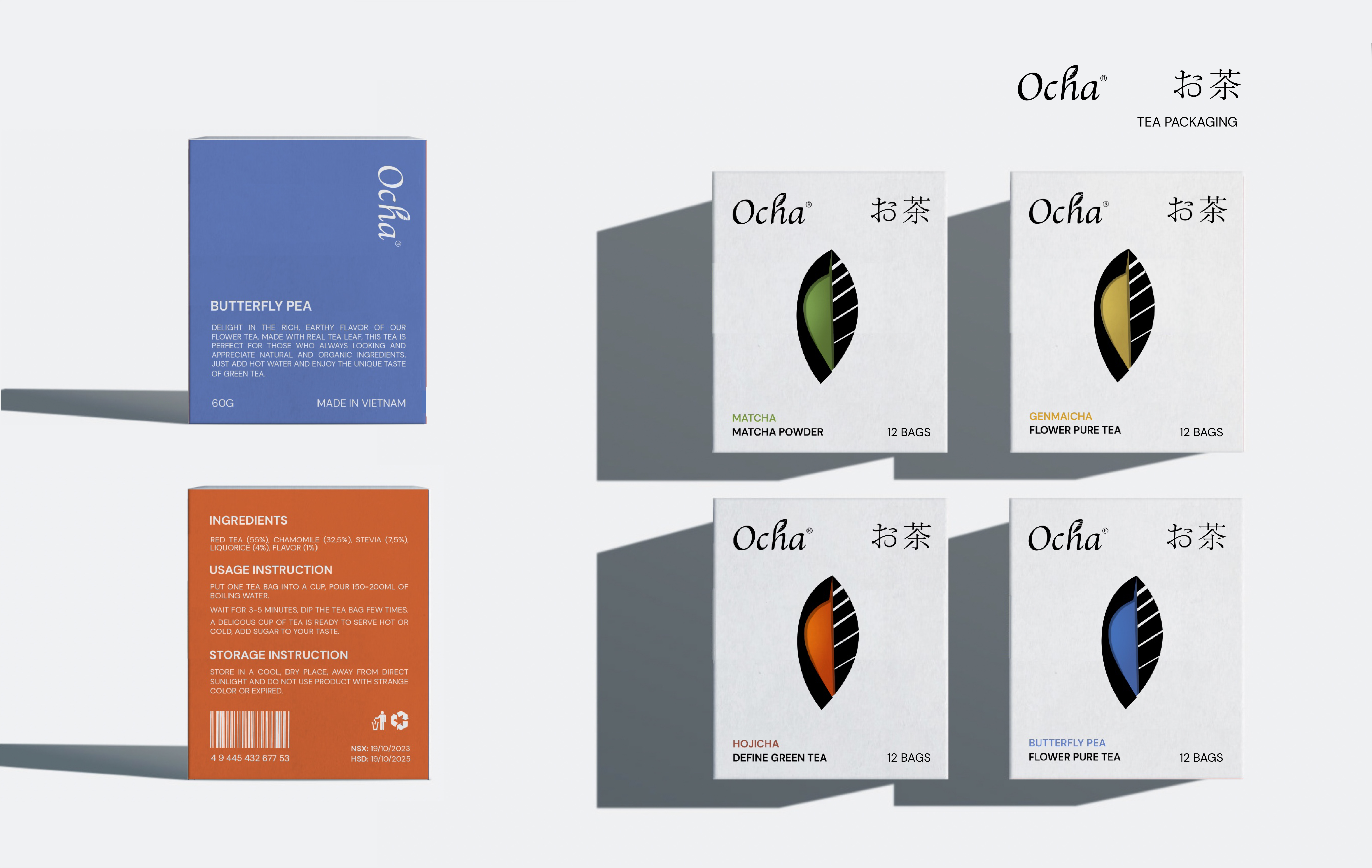
Ocha is a Vietnamese tea brand offering a variety of tea products made from tea leaves and flowers. With a minimalist design approach, it provides customers with a premium product line predominantly featuring white packaging with the brand logo. Additionally, the brand positions its tea products based on distinctive color schemes to make the packaging visually appealing. Ocha aims to target both young and middle-aged customers, particularly those who have an interest in and love for tea, or those seeking to purchase tea as gifts for partners, colleagues, or family members. The repositioning of the tea industry goes beyond packaging colors; it also emphasizes the importance of establishing a brand identity from the outset to cultivate loyal and trustworthy customers, ultimately driving increased purchasing intent among consumers.
- TARGET CUSTOMERS
With the goal of packaging driving sales, Ocha targets a premium tea brand model for customers who enjoy tea at home or want to purchase gifts for colleagues, family, or friends. The target customer group is between 25 and 55 years old.
Group 1:
Customers in their mid-twenties with a stable income.
Purchase purpose:
They enjoy tea as a daily beverage while working, reading, or watching movies.
They buy for the premium and stylish nature of the brand, seeking high-quality products and a wide range of tea flavors to explore, aiming to become loyal customers.
Group 2:
Customers who emphasize precision, appreciate elegance, have a preference for aesthetics, and might also be consumers of high-end fashion or products. They range from 30 to 55 years old.
Purchase purpose:
These customers have a certain level of tea knowledge, enjoy tea to stay refreshed and focused during work, or appreciate Ocha for its distinctive flavors and quality.
They are attracted to Ocha's beautifully designed packaging, high graphic appeal, and strong brand recognition, making them want to collect and explore the products.
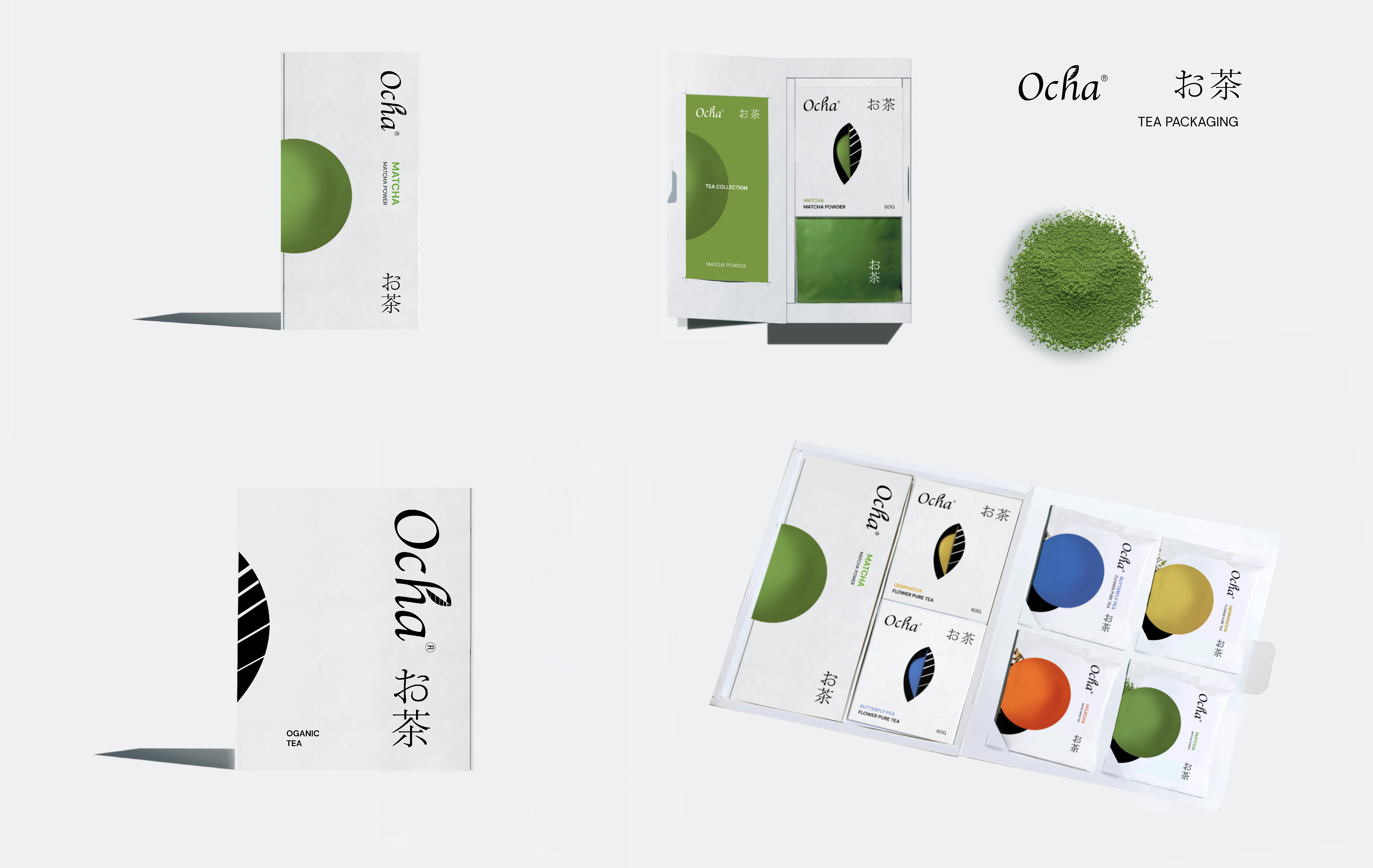
They also buy Ocha as gifts for customers or partners, as Ocha offers a premium and elegant "Gift Set" version. When purchasing one large tea bag and two small tea boxes (any flavors), they receive an additional four tea packets (can be chosen or random).
- LIMITATIONS OF PACKAGING
Currently, tea brands commonly found in supermarkets or local markets often use pictorial packaging (such as tea bags illustrated with images of steaming tea cups) whereas Ocha's packaging has a higher graphic appeal, utilizing tea leaves as a visual element, which may be unfamiliar to current target customers.
Most established or popular coffee brands in the Vietnamese market already have a loyal customer base, making it challenging to penetrate the market with a completely new brand and establish a high-end positioning from the beginning.
=> It may be initially challenging to attract customers and will require time for customers to become familiar with the brand.
- OVERCOMING THROUGH NEW PACKAGING
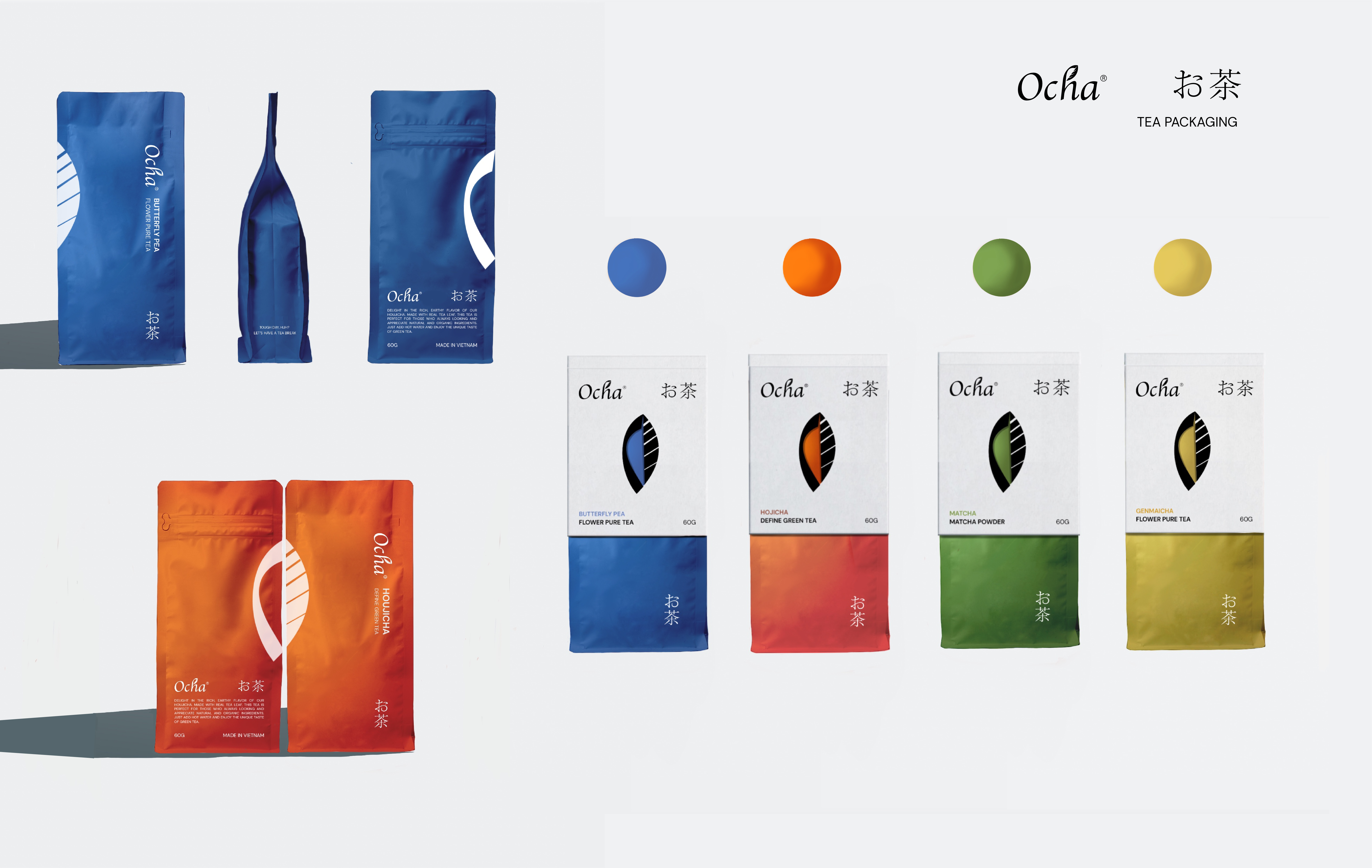
Diverse and calculated use of colors, predominantly white packaging, featuring colors that represent different tea varieties based on the prominent color of the tea itself on each package. This high brand recognition and premium design are eye-catching and easily accessible to customers, as the unified branding and visual identity help stimulate purchasing behavior as customers become more acquainted with Ocha.
Meticulously designed packaging with enhanced recognition and visual appeal when placed side by side.
Com'om brand designs secondary packaging divided into boxes containing 12 packets of each flavor, making it easier for users to purchase and explore new flavors.
Unique packaging in terms of color and brand recognition.
=> Increase sales promotion, and enhance brand recognition among numerous competitors.
- CONCEPT
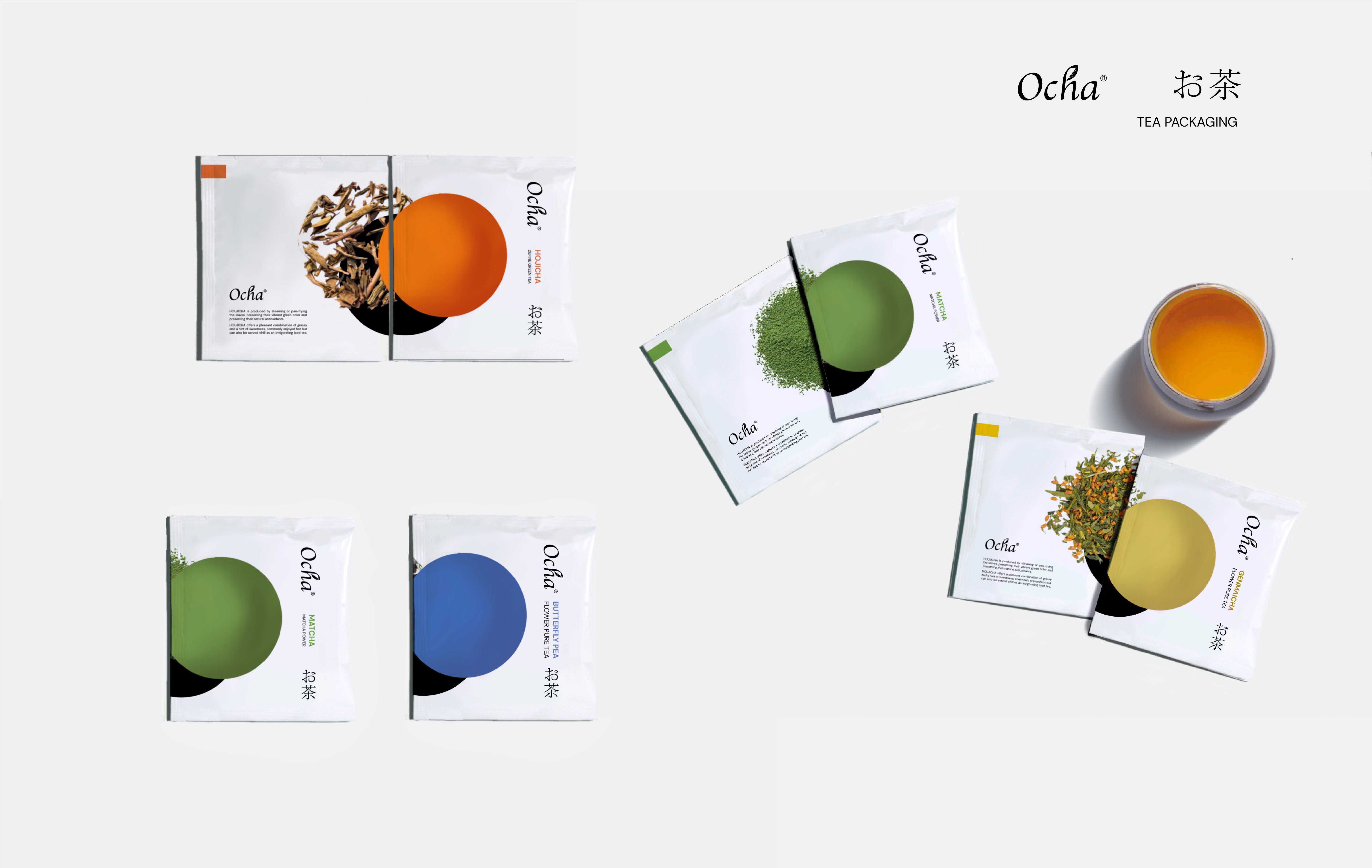
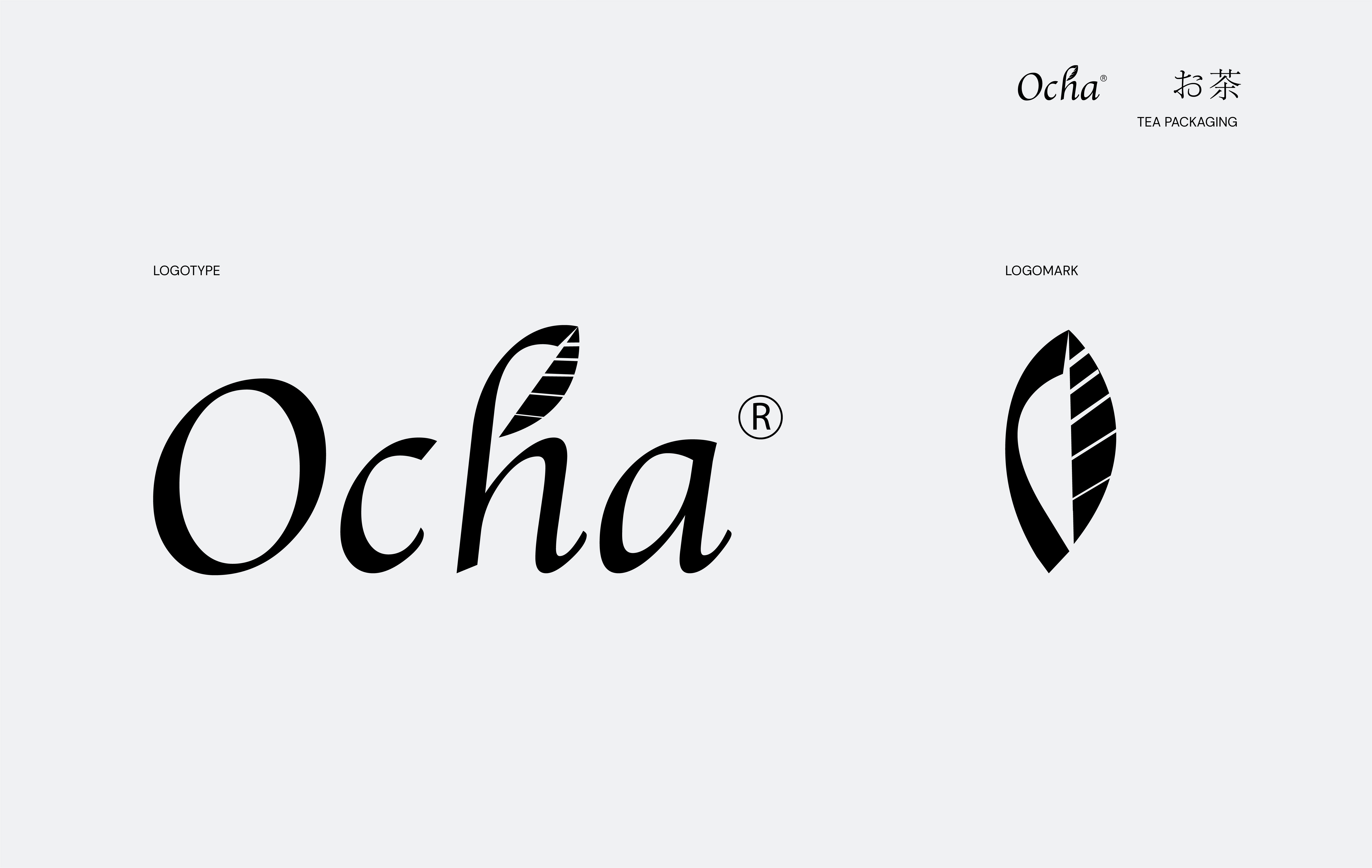
The Minimalist Japanese Style, along with the image of tea leaves (Logomark) and colorful circles (tea cups) representing the colors of different tea varieties, are designed to be repeated throughout the packaging, allowing customers to easily recognize and remember the Ocha brand in a short period of time.
The combination of white, a premium color, with colorful circles that are visually appealing will make customers remember the brand more. Ocha is not just a tea brand but also a lifestyle and minimalist approach that the brand wants to bring to customers.
The graphic design is simple and memorable. The high brand recognition helps new customers easily get acquainted with the brand and existing customers easily remember and repurchase.
The tea leaf imagery and the stylized circles are carefully arranged within the packaging to create unique highlights for each package while still conveying the overall message and spirit of the brand. This enhances brand recognition, as well as a friendly and accessible approach to the user's purchasing behavior.
The packaging structure is simple and uncomplicated to reduce production costs and optimize transportation and storage. All of these factors contribute to shortening the distance from the product to the brand's goal of promoting sales through packaging.
Repositioning the brand with high graphic imagery and a focus on personality/brand storytelling sets Ocha apart from existing coffee brands in Vietnam (which often use illustrative packaging). From this perspective, Ocha has the capability to bring innovation and shape the future by gradually changing consumer behavior in the Vietnamese coffee market.
- MATERIALS
For secondary, tertiary packaging, and gift sets, paper is used as a design material to save production costs, as well as aid in transportation, and storage, and contribute to environmental protection.
- For primary packaging, the coffee filter bag, a combination of plastic and paper materials is used to ensure longer product preservation, allowing customers to easily store and use the product multiple times.
- ALONG WITH THE THEME "PACKAGING DRIVES SALES"
Ocha will always have promotional programs and gift sets where customers who purchase any large tea box and two small tea boxes will receive an additional 4 tea packets for extra enjoyment, thereby stimulating purchases.
Along with the aforementioned aspects, Ocha's product packaging is designed with simplicity and basic structures, making it user-friendly, cost-effective in production and construction, optimizing space for transportation and storage, reducing product costs, and primarily focusing on graphic design and brand identity. This allows customers to visually concentrate and easily remember the brand for a longer time, fostering customer loyalty.
As a result, a relatively wide range of customers can access Ocha with reasonable prices, easy usability, and a push for purchasing behavior, leading to good effectiveness and transforming them into loyal customers. Therefore, "Packaging Drives Sales."
- แชร์: